Spent a good part of the day studying charts. There are so many different charts; can anyone tell what a Williams accumulation chart shows that a high/low/close chart doesn't. What does a MACD tell me about a stock that I can't feel by watching it all the time? That the pps is one standard deviation away from the mean, basically. For example, this is the most basic of charts from Yahoo, but very serviceable. Newmont Metals hit a fifty-two week high, which is naturally the place this excitable, uneducated investor plowed in. A month later, the stock has broken down, well below the 50 -day simple moving average, closing in on the 200.
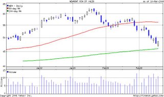
E*trade has an even better chart I can pull up in a few clicks, from within the real-time java application. I can compare any number of moving averages against the price per share. Overlapping two simple moving averages reveals a death's cross; the 10-day sma has dropped well past the 100-day sma. My strategy at this point is to possibly buy more shares under the 200 day pps average of about $46. peace out for now...


No comments:
Post a Comment